Rebranding healthcare with hope and empathy.

AIDS Project RI was founded in the mid-1980s  in response to the then-rapidly growing AIDS epidemic to provide care to individuals living with HIV and AIDS. With the advent of highly effective medications over the past 20 years, people with HIV can live long, healthy lives, but rates of transmission have risen in some demographics. AIDS Project RI worked with Studio Rainwater to rebrand the organization to reflect this new reality.

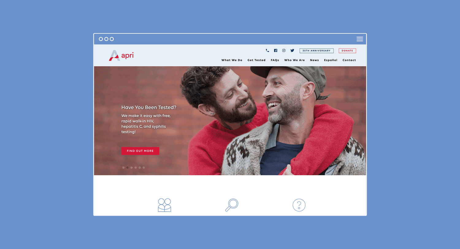
Without changing its core mission, the organization wanted to shift the focus to health and well-being to ensure that everyone has access to testing and medication. The brand needed to show the organization’s commitment to high-quality service and care, collaborating with community partners, educating the public about sexual health, and fighting discrimination.

AIDS Project RI

Building safety through subtlety.

The name was shortened to APRI to de-emphasize the word “AIDS.” While the organization still strives to challenge the stigma associated with the word, they also wanted to eliminate barriers to people seeking testing and care. The logo was designed to keep the red ribbon concept long-associated with AIDS as a more subtle visual cue, used in a clean modern way.

AIDS Project RI
AIDS Project RI
AIDS Project RI

“Studio Rainwater stood out from the get-go by listening to what we had to say and then translating that visually to tell our story. Their team was genuinely interested in our work and they gave us back ideas that were thoughtful and pushed us to look at ourselves differently!”

— Mikel Wadewitz

Ryan White Director, APRI

A warm welcome.

All the materials, including informational brochures and a website, were designed to project a positive energy and reflect the welcoming, friendly, non-shaming environment of the organization. Some elements even use playfulness and humor that doesn’t undermine seriousness of the disease and commitment of the organization.

AIDS Project RI

An unusual end goal: to be put out of business.

APRI’s big vision is to see an end to the epidemic and be put out of business, but until that is a reality, the organization has been positioned to ensure that care is easy to access and delivered with respect and compassion.

“After just a few months of our new look being out in the world, the difference is monumental. It’s made our staff prouder to be working here, and at community events and out in the world, people really notice us. It’s been a sea change in how we’re looked at as an agency.”

— Mikel Wadewitz

Ryan White Director, APRI

PROJECT SCOPE

Logo, Brand Strategy, Marketing Materials, Website, Campaign

FOCUS AREAS

Nonprofit, Health