For creative professionals, turning our expert lens on ourselves can be a challenge. Here’s how our studio pushed past paralysis and finally built our own brand.
We relate to that old saying about the shoemaker who neglects their own shoes. Over the years, we had poured energy into doing the best work for our clients and ignored our own brand. In late 2019, our studio had grown and evolved so much that our visual identity didn’t feel like “us” anymore.
With a few projects on hold when the pandemic hit in 2020, we suddenly had the time and space to explore who we really wanted to be. But playing the two distinct roles of designer and client proved more difficult than we imagined.
When we finally evaluated our own brand as seriously as we do for our clients, it fundamentally transformed the way that we work.
“As brand designers, we know the effort that it takes. We knew we had to treat ourselves like a real client. Finding the time to do it right, amidst doing actual client work, can be daunting.”
—Elizabeth Leeper
Senior Designer, Studio Rainwater

Phase 1: Our Strategy
A design therapy session to define who we want to be.
At the beginning of a project we ask our clients a lot of questions to tease out insights that might be hiding under the surface. Sometimes even obvious answers are hard to see when you are too close to them. Just like in therapy, this kind of self-introspection can be uncomfortable and humbling.
In our case, we admitted that weren’t experts at everything. We had to be willing to focus on the skills we were best at and not offer and all-you-can-eat buffet of services.
We also considered our audience. Just like we tell our clients, our audience is not everyone, because no one can effectively reach such a large demographic. There is a specific set of clients that we are really, really good at helping.
“Once you define your brand, you are clearly stating ‘This is who we are.’ That means understanding who you aren’t, and turning your back on some things. Saying ‘no’ is so important for growth, but it can be scary.”
—Sarah Rainwater
Creative Director, Studio Rainwater
We knew that we were most effective using a “brand-first” approach. That means we are always looking at the big brand picture whether we are building a brand from scratch, rethinking an existing brand, or expanding on an already strong brand foundation
We are at our best when we work with clients who are looking for a thoughtful strategy that ensures the design will always be deeply rooted in the core brand values and organizational goals.
As we refined our process, which you can read more about here, we also realized that it was less important for us to focus on a specific industry niche than finding clients that shared our values and mindset. We take what we do very seriously and believe that a strong partnership and openness to collaboration is key to a successful relationship.
Phase 2: The Brand Audit
Deciding what should stay, and learning to let go.
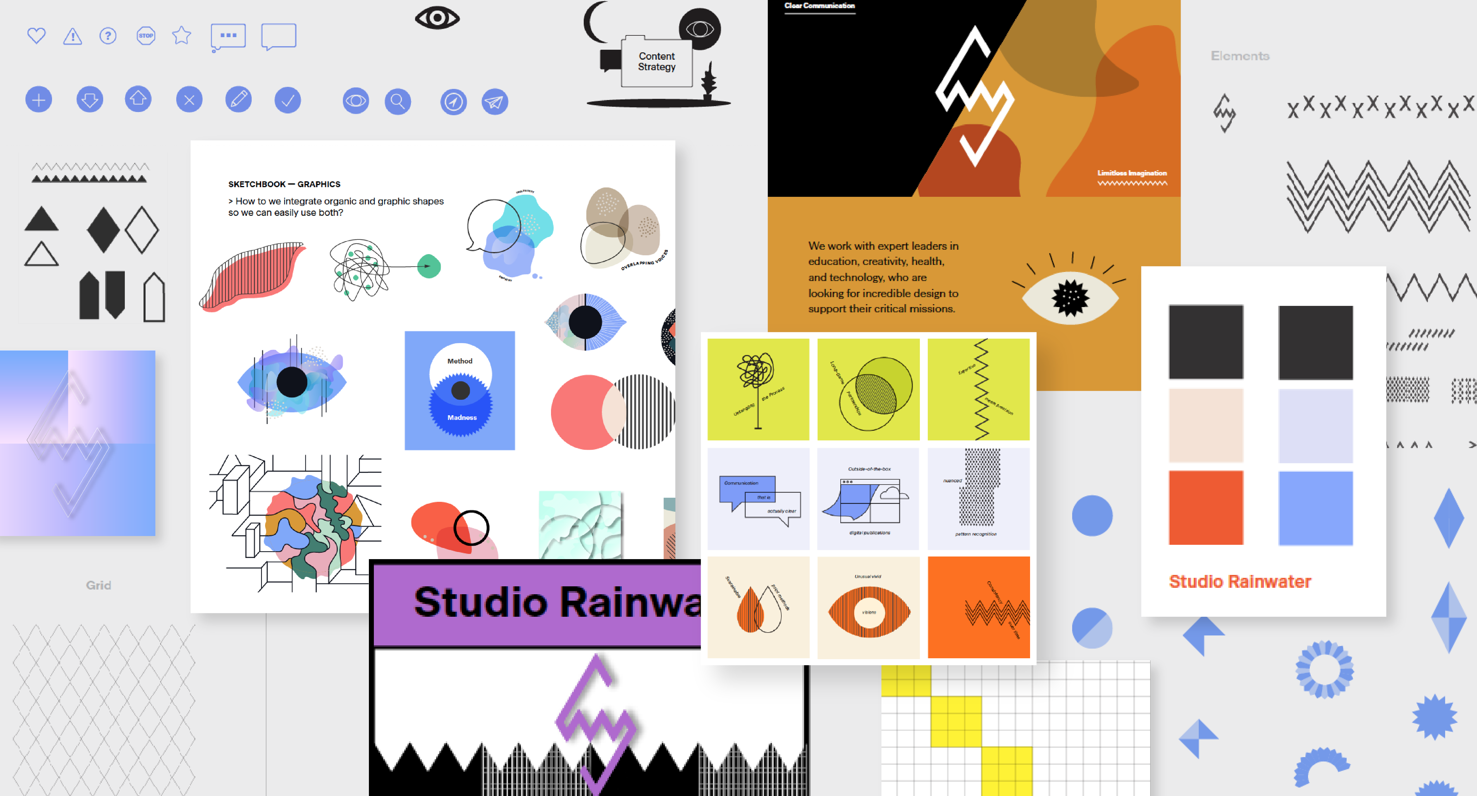
Once we defined our strategy, we took a hard look at our existing brand to decide what elements should stay and what needed to be redesigned. We knew we wanted to keep our logo and the sense of playfulness that defines everything we do. We bring joy to our work, while also maintaining a hard focus. Our work is sharp; it has teeth. The black that eventually emerged created the contrast we needed against the many colors we use for clients.
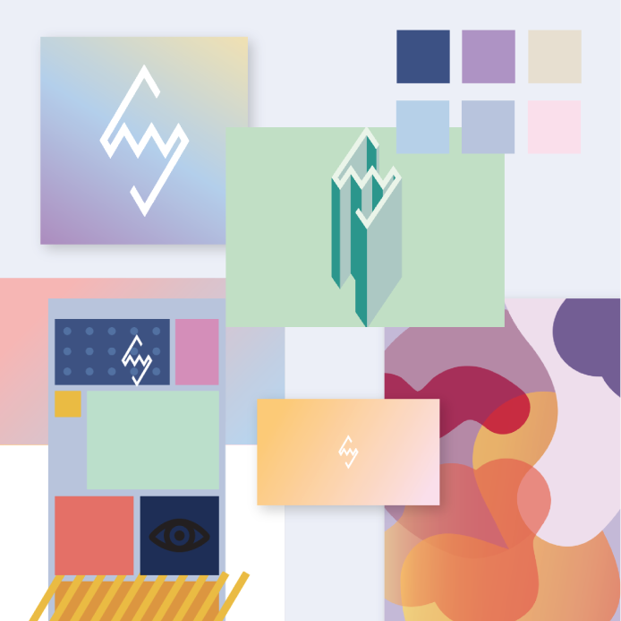
When we started out, we were small, and open to many possibilities and opportunities. We didn’t want a strong identity to define who we were, because we were still figuring that out. We used soft pastel gradients and fluid shapes. But as we grew, they felt too light and delicate, and didn’t fully express the strength and boldness of our work.
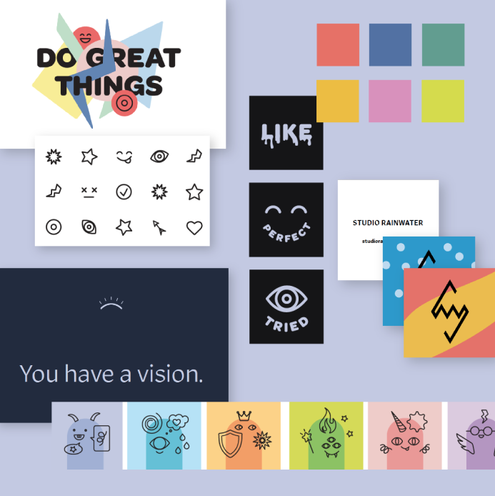
In 2018, we focused more on strategy, which led to creating resources and frameworks to help our clients better understand this approach. This manifested in technical how-tos, icons, and using characters to explain our concepts and ideas, but eventually felt overdone and too playful.
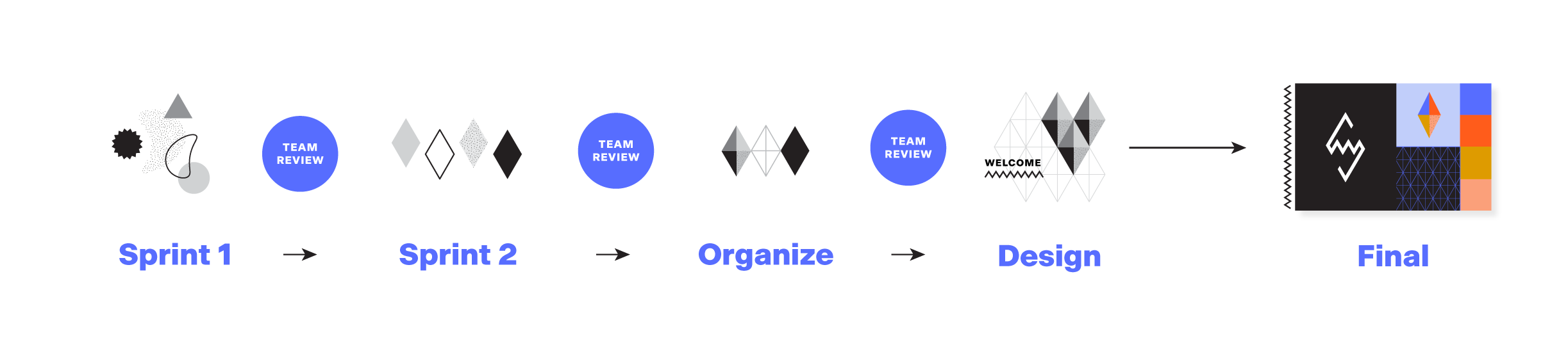
Phase 3: The Sprint
Individual imagination meetings collaborative curation.
In the next phase, we created space for our team to design independently in concentrated sprints. These produced hundreds of sketches that we would review and reflect on together. We never rushed, but we tried to make decisions quickly so as not to hold ourselves back with uncertainty and perfectionism.
Sprints allowed designers to have the quiet time they needed to explore the creative boundaries while also getting supportive input and feedback regularly to keep the design on track. This process allowed us to easily to share and combine ideas and push the concepts much further than if everyone was on their own the whole time.

Working in sprints has become a cornerstone of our process, making it more exciting and supportive.
Our system for working echoes the final brand: a framework that defines clear boundaries while remaining flexible enough for improvisation and instinct.
In our sprints we were able to identify common themes: repeating colors, extending the logo into patterns, and building from a flexible grid.
In the end, we edited out hundreds of visuals that we loved, but that weren’t telling a cohesive story about who we are. This process allows for messiness and mistakes so that the resulting design can be more fully realized and polished.
“We need to be comfortable with the risk-taking, but within a safe environment. Play is part of our ethos because it helps us make interesting discoveries.”
—Sarah Rainwater
Creative Director, Studio Rainwater
Phase 4: The Final Edit
Putting all the pieces together.
The driving question we asked ourselves while curating our sketches was, “Do these visuals reflect our strategy?”
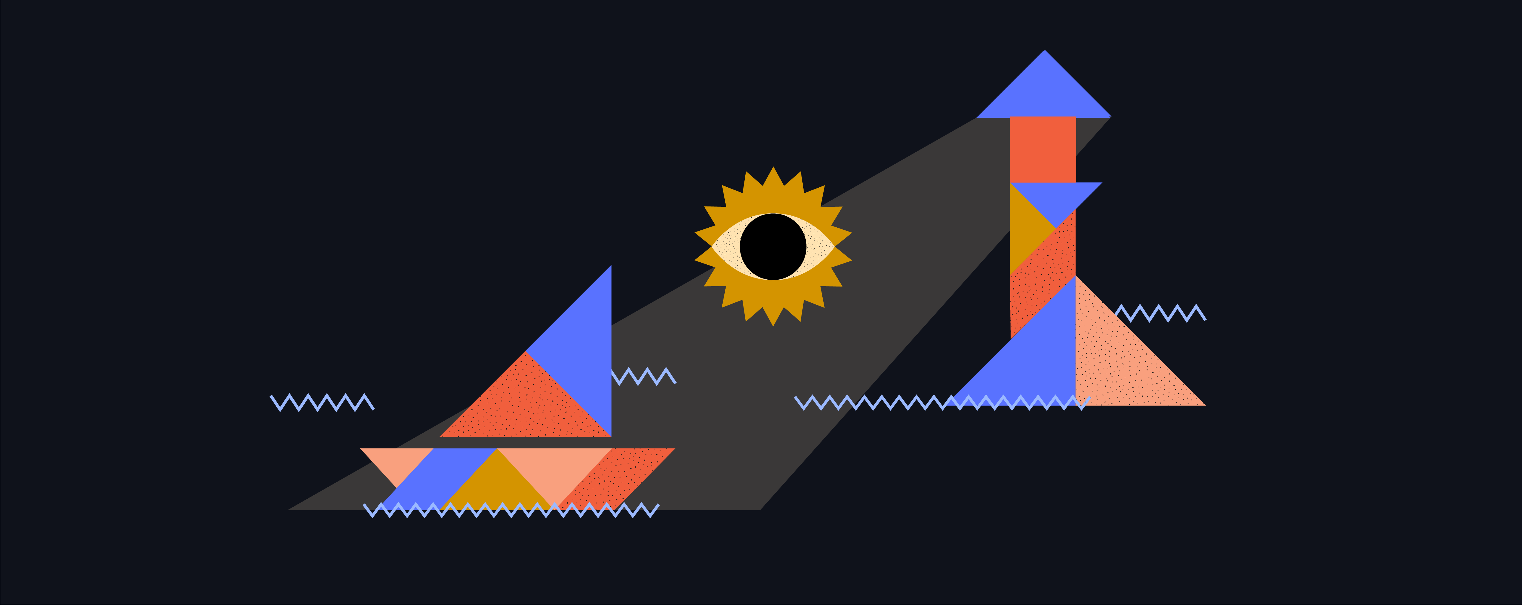
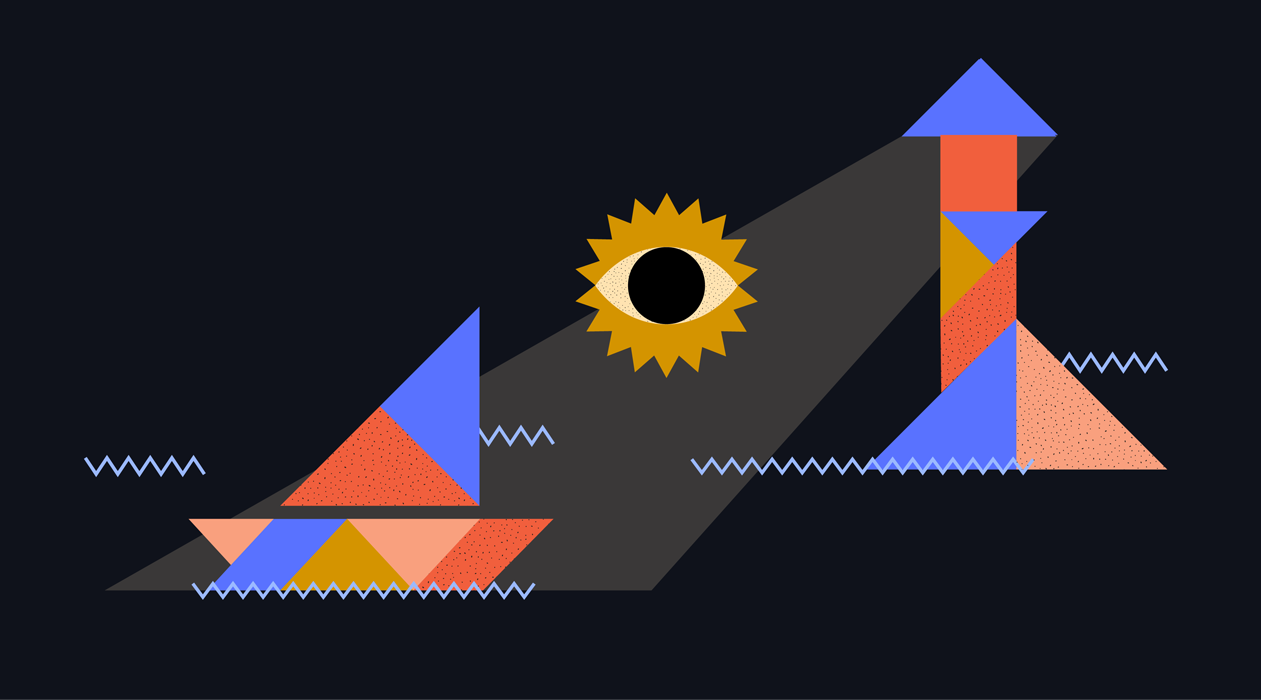
Design is fundamentally about collecting existing elements and combining them in new and interesting ways. We wanted our brand to reflect that aspect of the work: a creative puzzle with infinite solutions. Eventually, this lead us to the idea of incorporating tangrams.
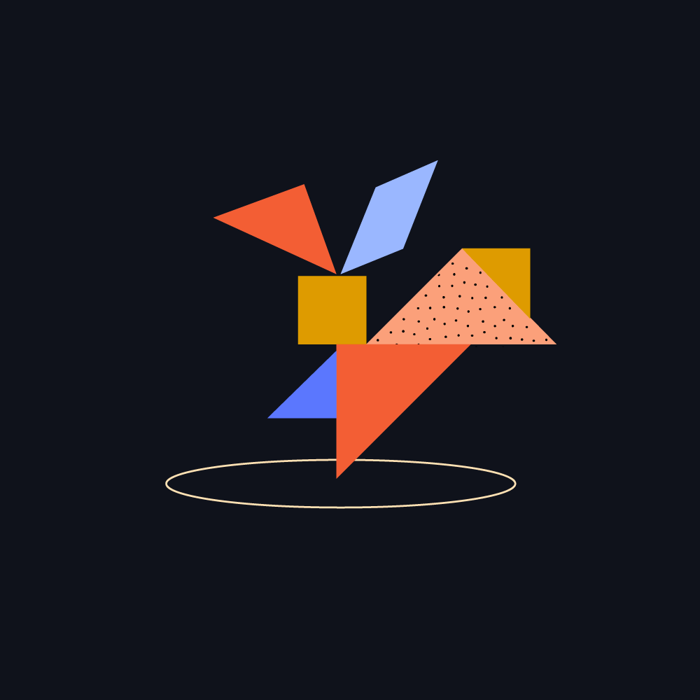
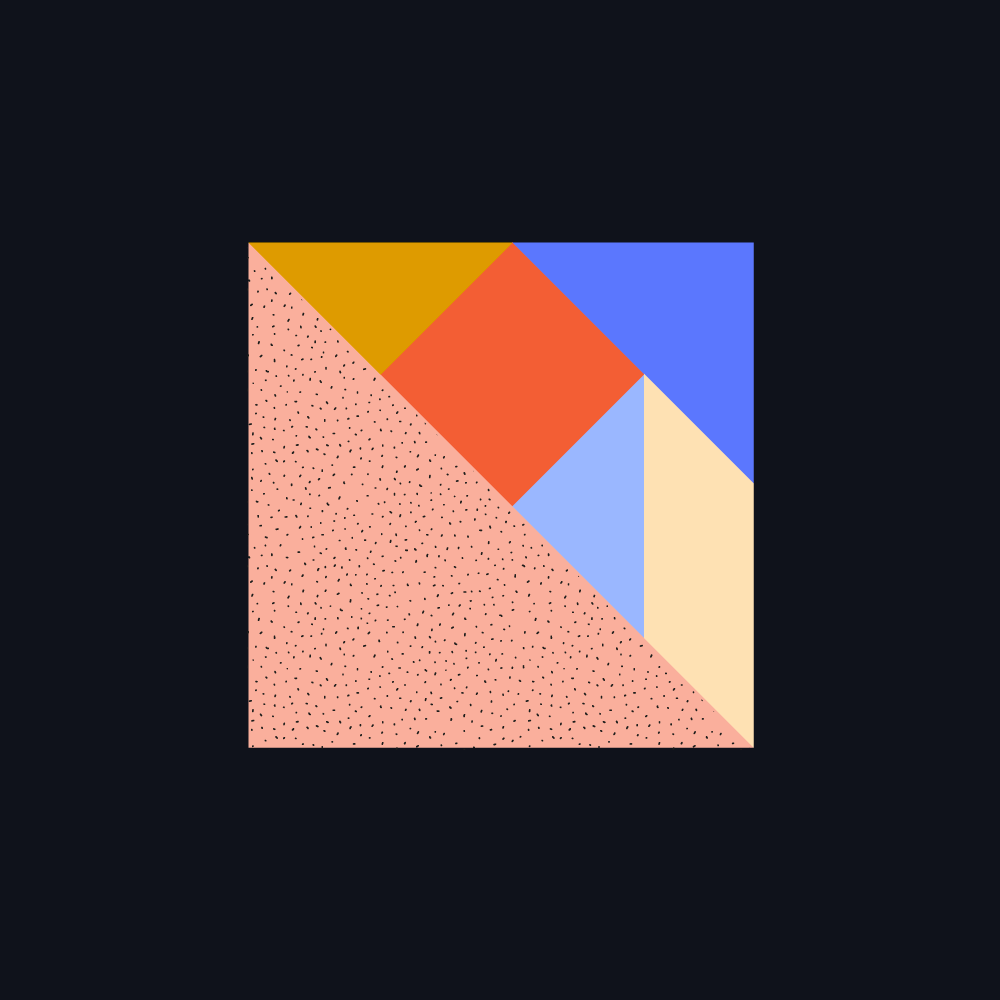
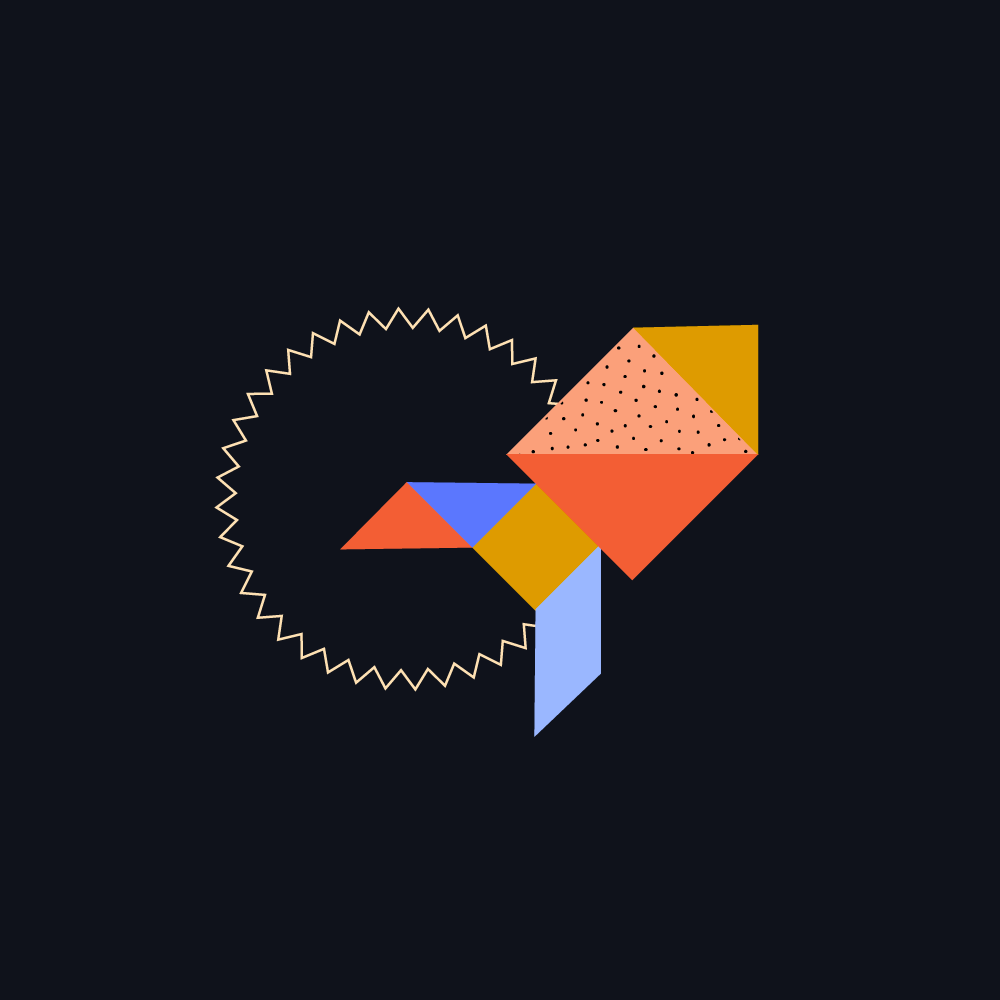
“Tangrams are great example of how a toolkit can work like a puzzle with many solutions. They represent what our brands strive to be: universal, accessible, and somewhere between abstract and representational.”
—Sarah Verity
Art Director, Studio Rainwater
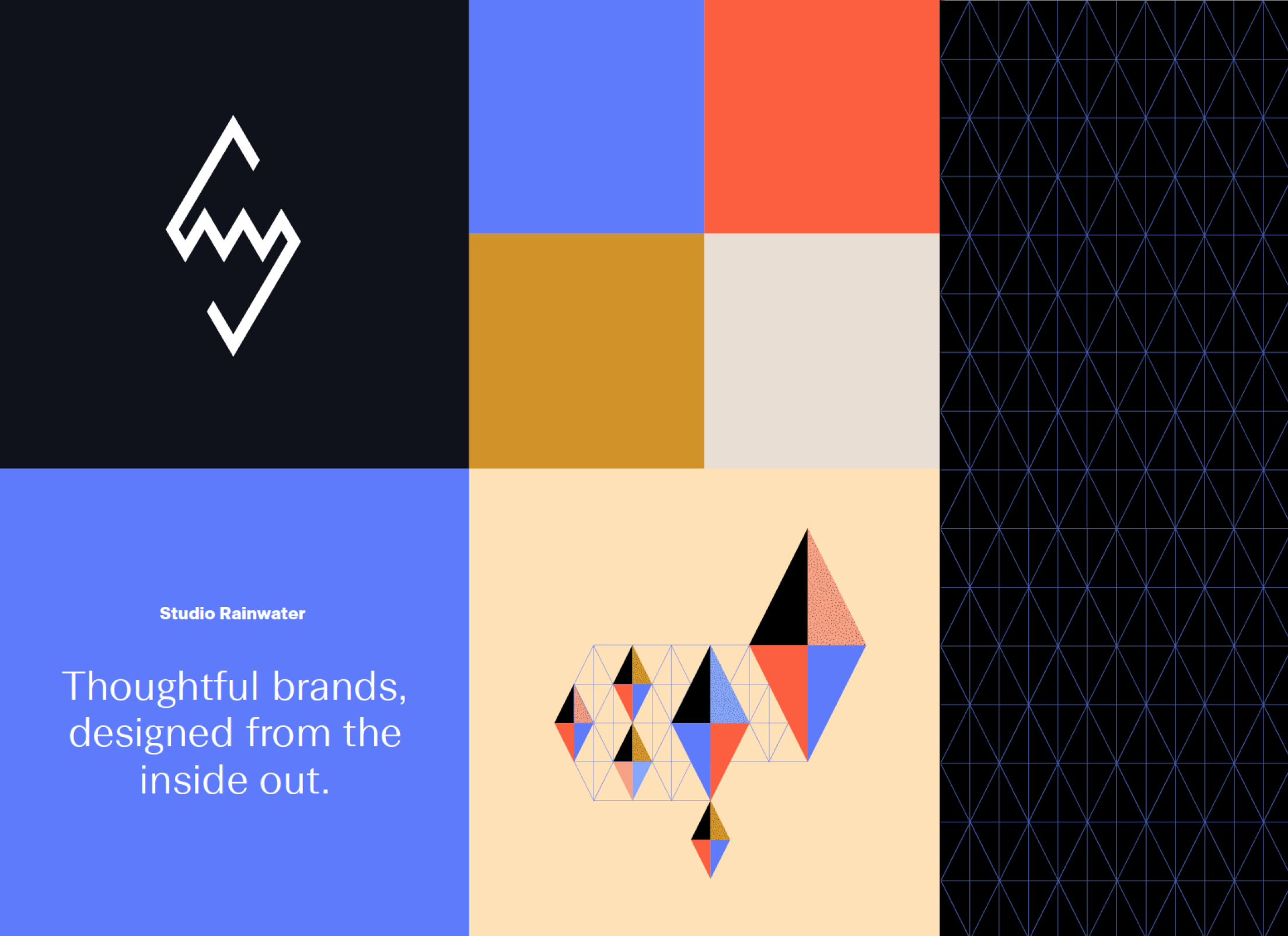
The final elements grew out of the original logo’s toothy diamond shape. From that we created a triangle-based grid that the tangrams, the logo, and other elements can freely repeat on.
The color palette feels slightly retro, but also classic and outside of time: a nod to our team’s shared love of gaming and crafting.
“Even though so much is digital now, we still love analog things, and that’s something we’ve woven into our brand. This speaks to me about what is classic and what is enduring, and what the actual essentials are.”
—Willow Rambert
Digital Design Director, Studio Rainwater
In the end, we were thrilled that we managed to please the most discerning, picky, know-it-all client who expects nothing less that perfection (yes, that’s us).
But more than anything we’re excited to share it with our clients: past, present, and future. All our best work and success comes because of them.


