Refreshing an established architecture firm’s brand for its next stage of growth.

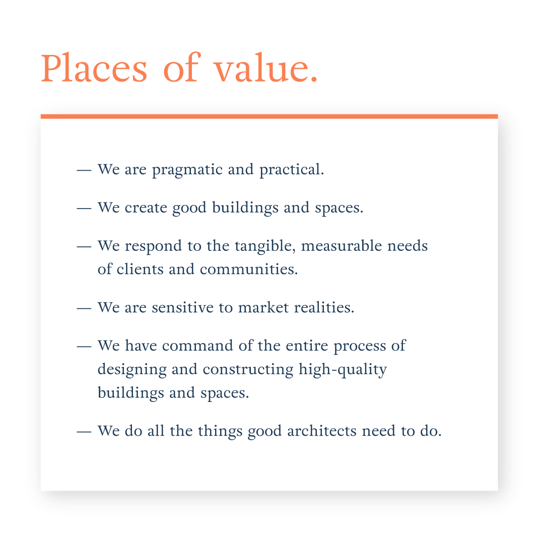
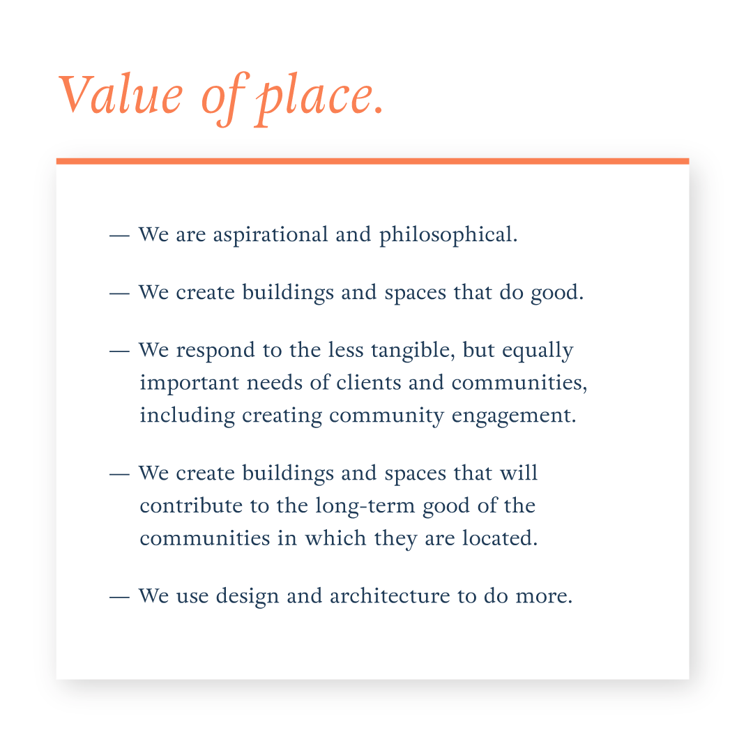
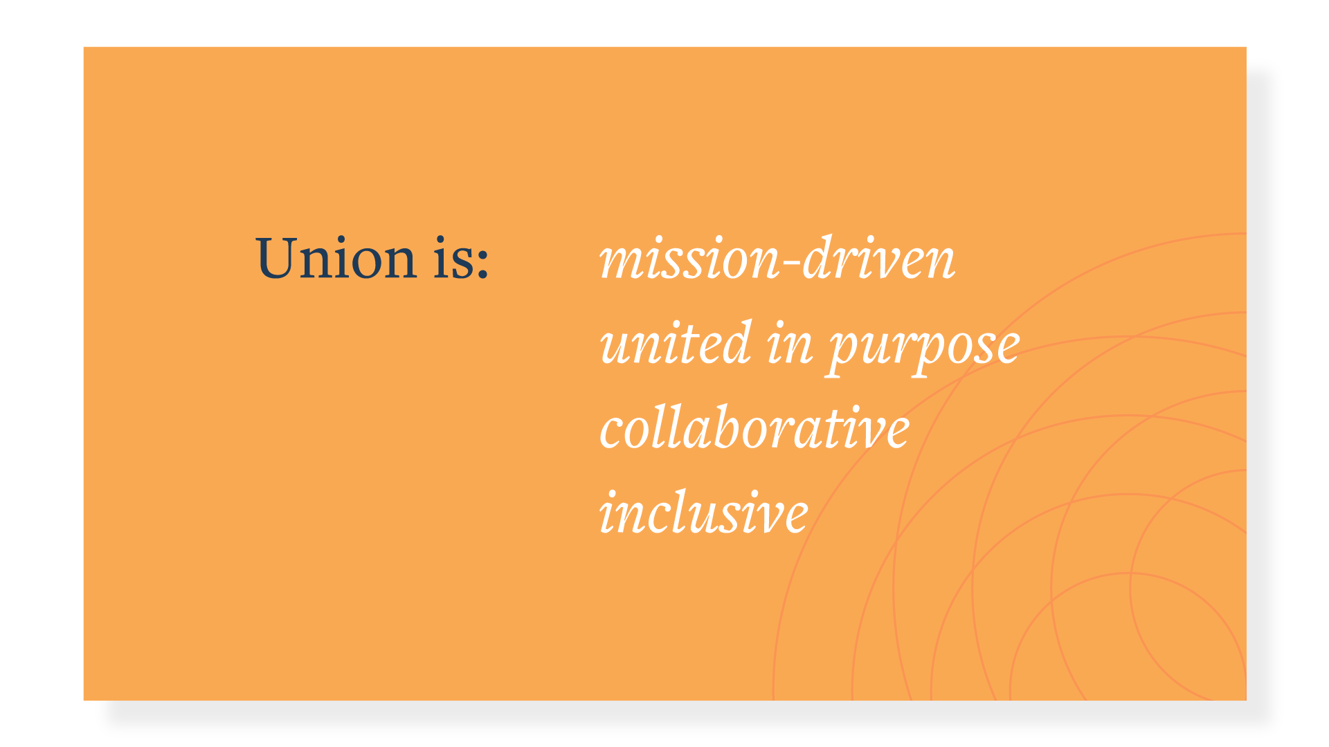
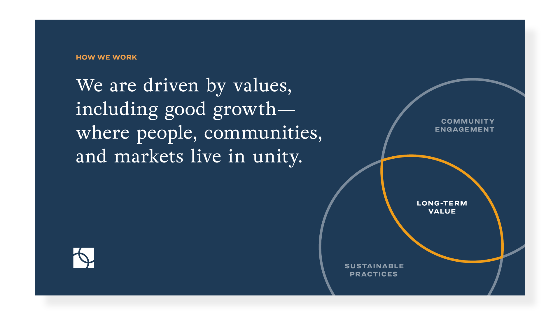
Over the course of twenty years Union Studio Architecture & Community Design had grown from a small upstart architecture studio to a mature company working on complex projects across the country. Driven by their core belief in making positive civic contributions and creating long-term value for clients and communities, Union designs with a sensitivity to history, preservation, sustainability, and peoples’ lives and work.

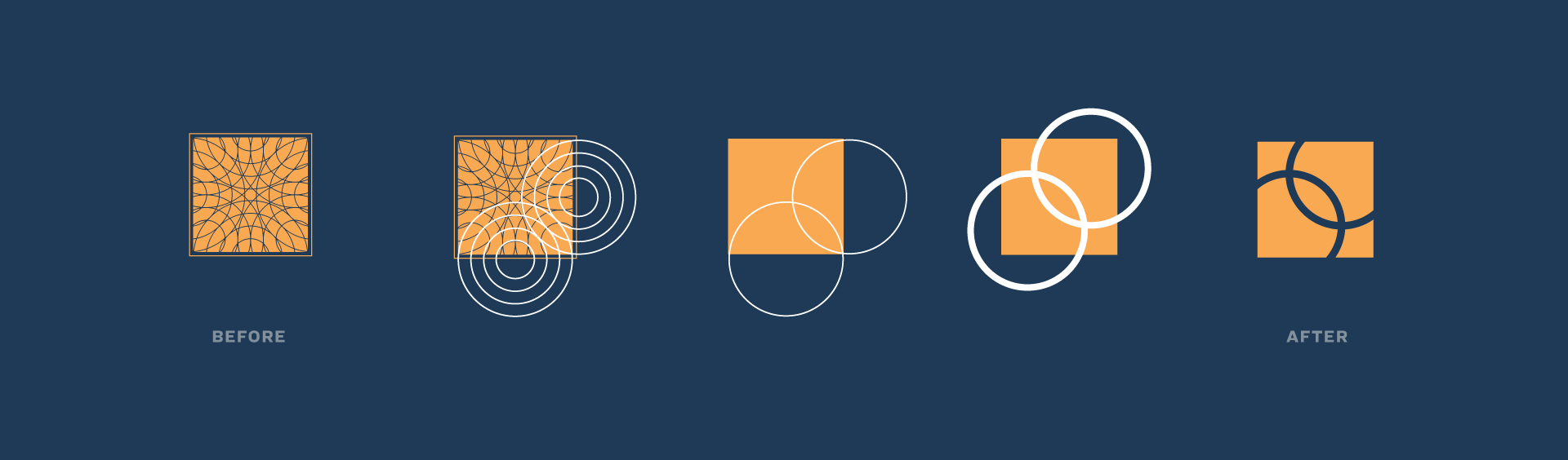
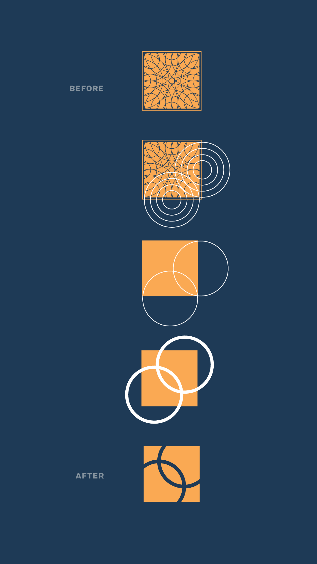
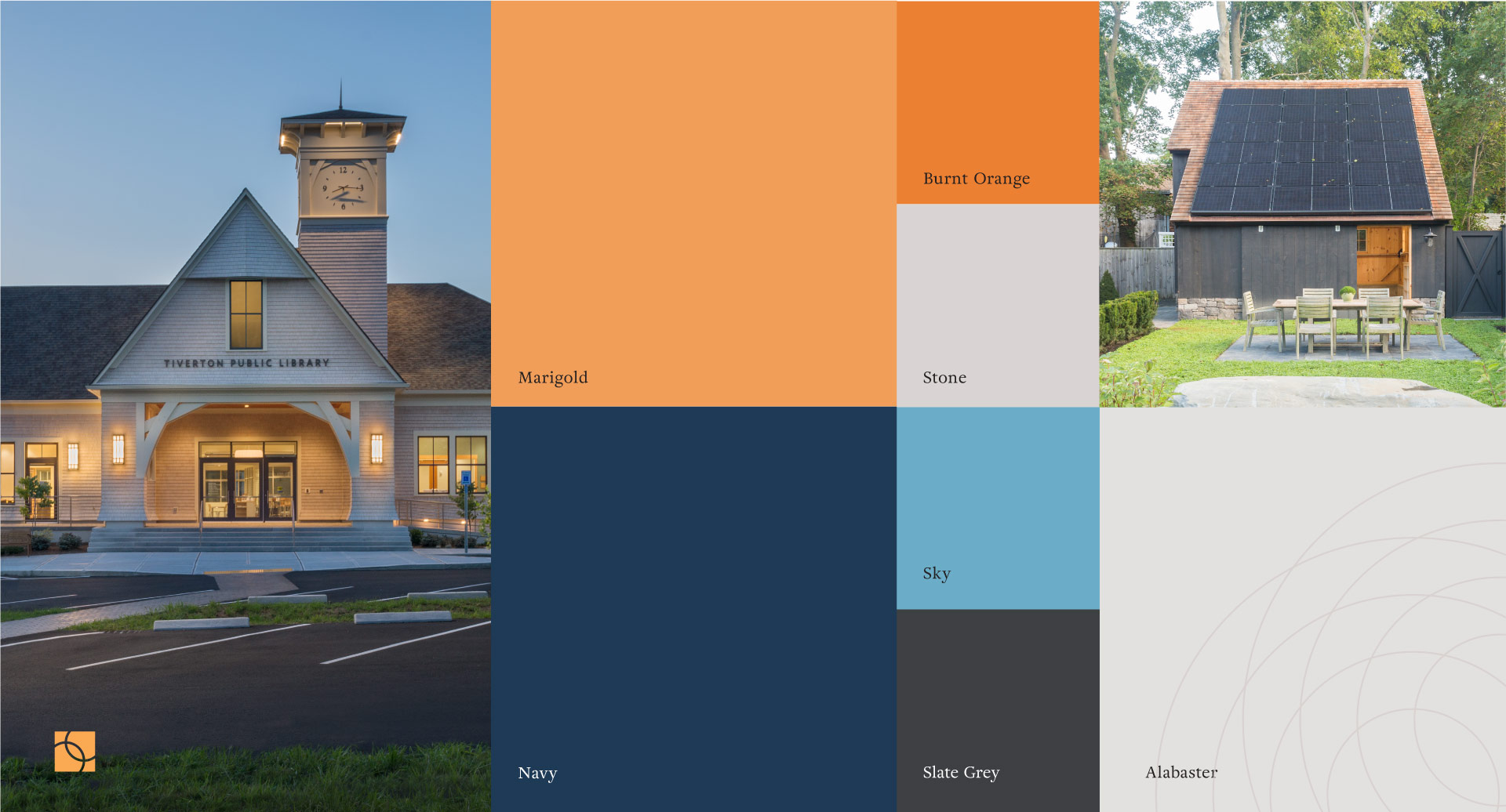
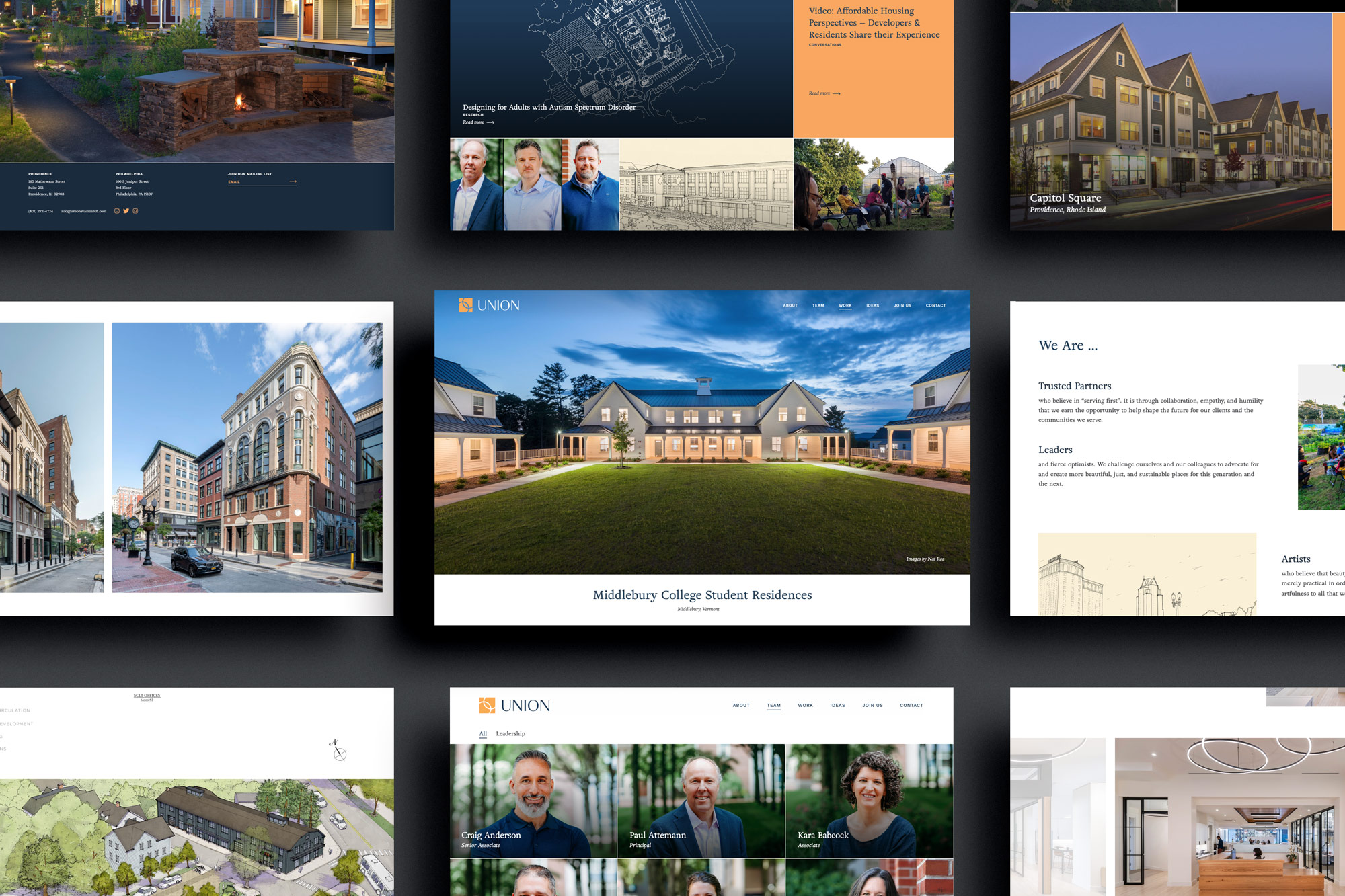
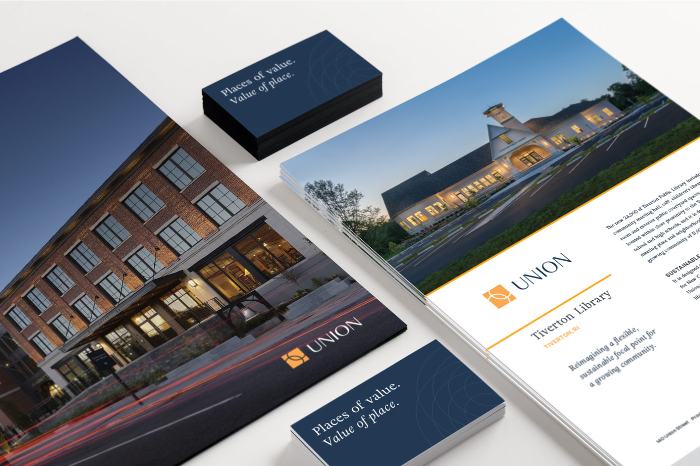
Eyeing further expansion, Union needed a brand refresh that would match their ambition of being a top firm in the U.S. and provide the flexibility needed for marketing across many platforms—without losing the connection with their history.

Partnering with verbal branding strategist, Michael Floreak, we developed a brand platform that defined Union’s unique position in their market, including a tagline that sets up a two-part message to reinforce the firm’s relationship with the world around them: Places of Value. Value of Place.

The brand strategy guided the redesign of Union’s visual identity, evolving and expanding on the existing system while maintaining continuity with their past. The old logo was beautiful and well-liked, but difficult to reproduce on screen and at small sizes. The brand also needed a more expansive system of elements that could be used on a variety of materials.

Through the design process we explored a range of approaches—some close to what existed and some that were more dramatically different. The final logo design was a simplified version of the original: two circles locked in a strong connection and opening

The new mark serves a visual representation of Union’s values: mission-driven, united in purpose, collaborative, inclusive.

Updated typography and an expanded color palette completed the brand system which was then used to create a suite of materials including a website, stationery, proposals, presentations, and social media templates.

“Our new brand maintains, simplifies, and updates elements from our previous brand, and creates a sophisticated look and feel that better represents who we are today, and where we’re headed for the future.”

—Douglas Kallfelz

AIA, LEED AP, CNU, Managing Partner, Union
Photo credit: Susannah Bothe

PROJECT SCOPE

Brand Strategy, Copywriting, Logo and Visual Identity Design, Website Design

PROJECT FOCUS

Architecture, Design, Urban Planning